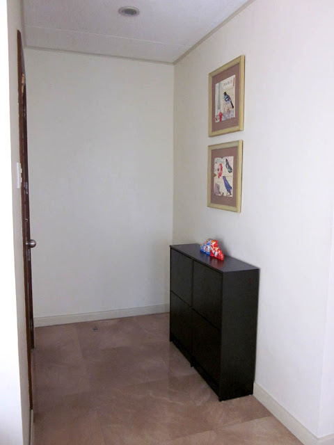
Our house was newly renovated when we bought it so everything came as is. I've always found this area quite tricky since it was too small to really dress up. This is the view when the door is open. See how close the wall is to the door? I really have to choose my furniture wisely or the space will end up cramped.
I wish the wall facing the door was a few feet farther to have more space to put some furniture like a console table and some chairs. What happened after a while is that all our shoes would pile up on the floor so the obvious solution was to get a shoe rack. I wanted something that still looked stylish and I found the perfect one at Mandaue Foam (and it was on sale at 20% off!). It was slim which fit perfectly in the space and it didn't even look like a shoe rack!
I also originally wanted to put a mirror on the wall above the table but this is apparently bad feng shui. The reason it is not recommended to have a mirror facing the main door is because the mirror pushes away all the good energy that is about to enter the house. So I just decided to hang some artwork I had initially bought for the living room.
 |
| view when you enter the door |
 |
| I love everything about these frames/artwork! It's exactly my style. |
 |
| I love the 3-dimensional quality/texture of the frames |
Here's a closer look at the photos. I was drawn to these the moment I first saw them since it featured birds, flowers and Paris! A perfect combination. =)
If it was up to me, I would like to dress up the top of the table with a lamp or some vases. But this is impossible with the two kids running around. So for now, I placed these wooden Matryoshka dolls as an accent piece.
This is the overall look for now. A lot more interesting than it used to be, but still getting there...
I still want to incorporate a mirror in this area to make the space look bigger and less bare. I've decided that a full length mirror mounted on the blank wall to the left of the door should do the trick.
 |
| The magic of photoshop! I hope the mirror I end up buying looks as good as this one... |
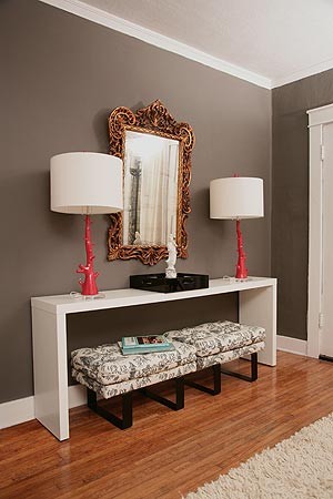 |
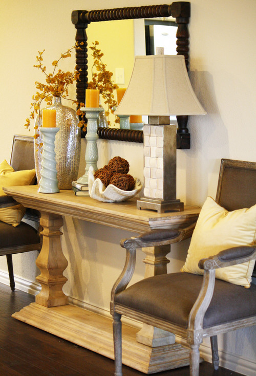
| I really wish our foyer area had more space for something like this. I love how everything comes together - from the ornate mirror with the funky lamps, to the fabric of the ottoman chairs. |
Will update you guys as soon as I finish decorating this space! =)


No comments:
Post a Comment